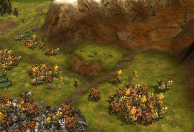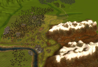
This is a tilted view from Silverymoon looking toward Silverymoon Pass in the Nether Mountains.
I changed up the texturing and you can see this is looking very good. I am also very impressed with the way the Silverymoon Pass came out. I used a little brown and orange coloring on the textures to make the mountainside and "broken" land of the pass come out.
On top of that the area around silverymoon now look very authentically Autumn. I probably could do a better job with the textures, but I think this will do for an overland map.
On to the Moonwoods.

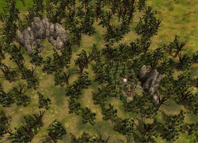
Basically each part of the Moonwood I'm making are going to have a slightly different forested look as in the above example. This is the place around One Stone and the Sky Pony camp. These two points are map locations. The one to the right is One Stone, the one to the left is Dragon's Heart, both of which you've seen in previous areas I've designed.
In this specific area I've been able to match the textures to those I used in that specific location. And it's turning out really well. When this map comes out it's going to be a very subtle blend of one environment into another, into another.
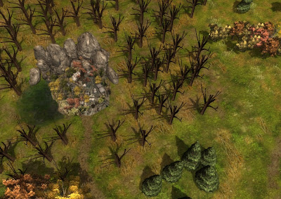
As in the example of a completely different texture pattern around Quaervarr in the Southern end of the Moonwoods.

You'll notice older areas of my Blog I showed Quaervarr and the screenshots of what the area looks like. Well this was no exception. I've mapped the texture pattern as close as possible to Quaervarr so it will seem a smooth transition when you enter the town.
Keep in mind this will have Tree coverings I left out so you could see the texture job.
Admittedly though I am having to squeeze and get really creative with textures, because you're only limited to 6 textures in any 4 square area, and sometimes to get the environments correct I'd need a good 8 because of the blending from one environment to another.
To close... it is an intricate job, as you can see I have more of the Overland map done, but it's still not a large amount.

But if you want to do it right... it is an intricate thing.
6 comments:
Nice work on the overland map, Phoenixus! Your texturing work, as always, is top notch, and you really seem to be hammering out a nice area at quite a pace. It's definitely nice to see that you're still actively modding.
looking really good, and i like the different look to the pass to make it stand out from the surrounds. Have you checked out the frame rate you get with real trees in? I remember Obsidian saying anothe rreason for fixing the camera angle in the map to have it pointing down, was to cut back on the polygon count, so I wasn't sure if real trees would cause hiccups..?
I just tried out making an overland map this weekend, and it's been fun so far - I made a custom fx of a region i wanted from the FR map, and used that to trace the outlines of areas - otherwise, my scale would have gotten skewed. Done the terrain molding and on the early texturing at the moment, and can see what you mean for the texture issues. After looking at the two maps in SoZ you can understand the texture choices and terrain layout they use.
Thanks guys,
Wyrin, I haven't checked out framerate yet, but mostly I don't expect problems I don't have that many trees in an overall sense, there's just a couple of places they're togather, but even then the camera will also be pointing down so it should be fine.
I didn't make a VFX for this though, I just went by eyeing the map and then heightmapping according to visual guessing. Scale wise it came out very well. it's kind of a shrunken version of it (Still 20x20) which is good. It will make a good representation of traveling overland in the Silver Marches.
But yeah you too can see how interesting pre-planning your textures is going to be.
Great results Phoenixus!
Once again you have set standards in area/map design that are well above the average ... and send a shiver of fear down my spine at the thought of how much work you must put into doing this. ;)
If I get results half as good, I will be happy ... I just hope players will be as well. ;)
Lance.
Hey Phoenixus - it's good to see you back in the saddle. And even better to see wonderful screens again. ;)
That overland map looks Awesome - keep it up!!
By the way, I played Tragedy patched to 1.21 and everything seemed to be working fine. Not that that'd matter much, given that the release of 1.22 is very close. An excellent adventure; cheers!
Post a Comment