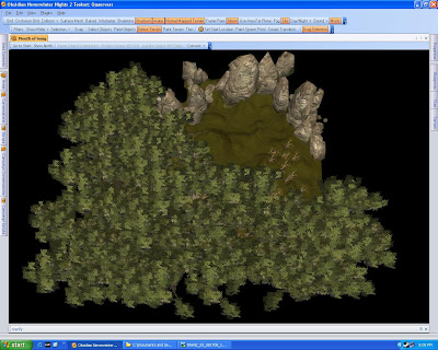
Admittedly now that I've added some of the Tree overhead before Placables it appears that the texturing job will be fine, But Frank may be right. I might have to make lighting adjustments instead as it requires full shadows to get the correct view of the forest.
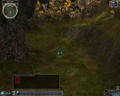
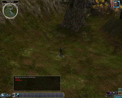
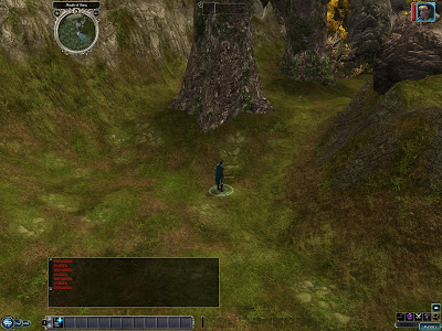
This is what it looks like on the ground before any real placables with the full shadows as intended...

I think this will do, but I've been thinking about what Frank said about it. Perhaps ignoring the full shadows and going with a total lighting adjustment with placed lights. I have looked at the area with full shadows and without and admittedly without shadows and some various placed lights may very well be the ticket.
Full Shadows shot...

No Shadows Shot

4 comments:
Hi Phoenixus,
I have been adding NWN2 builders to my blog lately and yours is one of them. :)
I thought every screenshot (with or wothout shadows) looked great, but I am not a very good artist and am not a good judge of that sort of thing. I am easy to please there. ;)
I hope to become a regular reader if time allows it.
Lance.
Well thanks Lance,
I'll have to add yours too then.
From my standpoint I guess it doesn't really look bad, it just seems to be missing what it was I meant this place to look like.
I'm very impressed by this area. Putting trees above the landscape and then having light filter through is a good feel. Point lights could, perhaps, capture the look, but it somehow seems less dynamic than normal day/night settings. I like what I see: left as is, unless there's a truly niggly feeling you can't shake, is perfectly acceptable.
You could, perhaps, cut some of the trees from the canopy to let more light filter through. Fill those 'sunny' sections with underbrush and such--if nothing else, it could have an interesting effect. I'm probably rambling--and I might have to make that myself. ;)
So, how is it going, Phoenixus?
Post a Comment